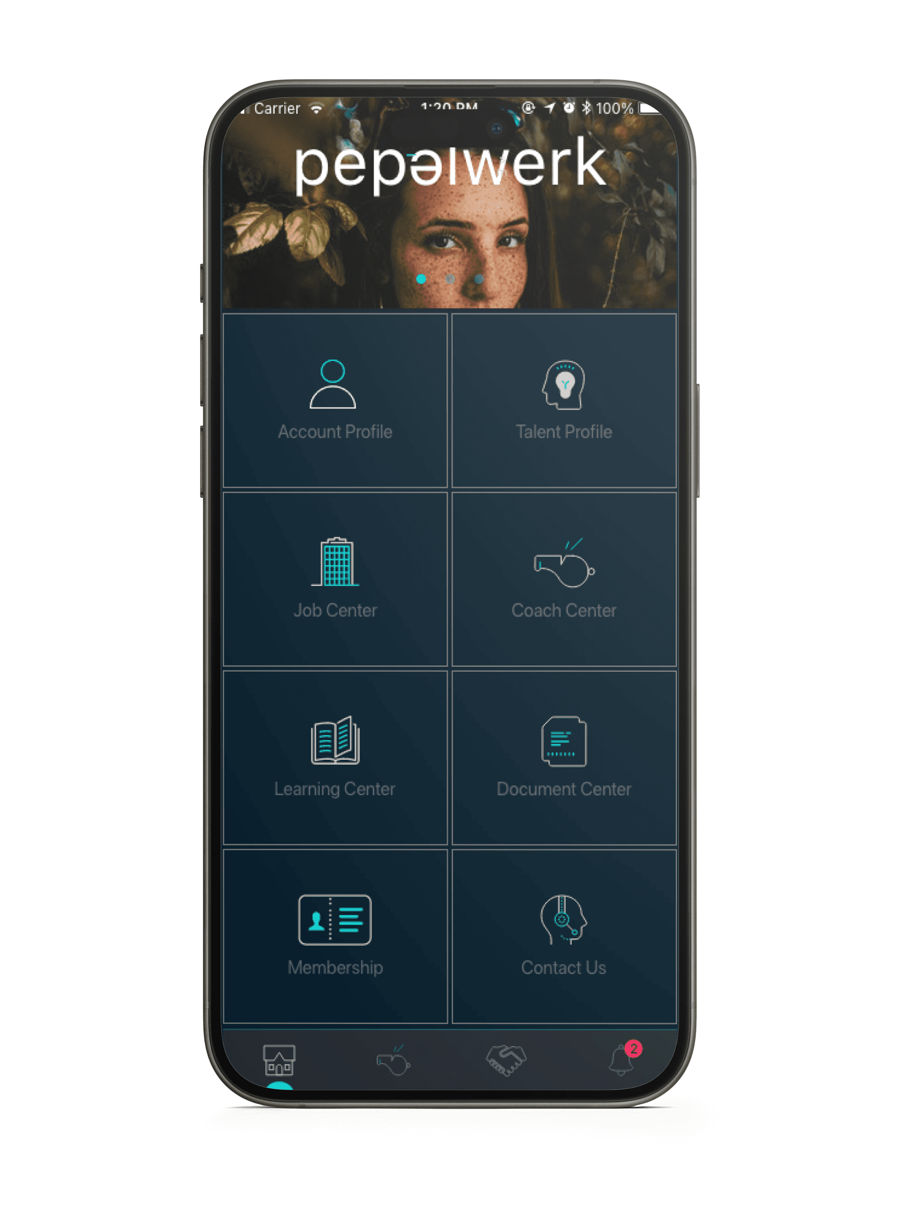
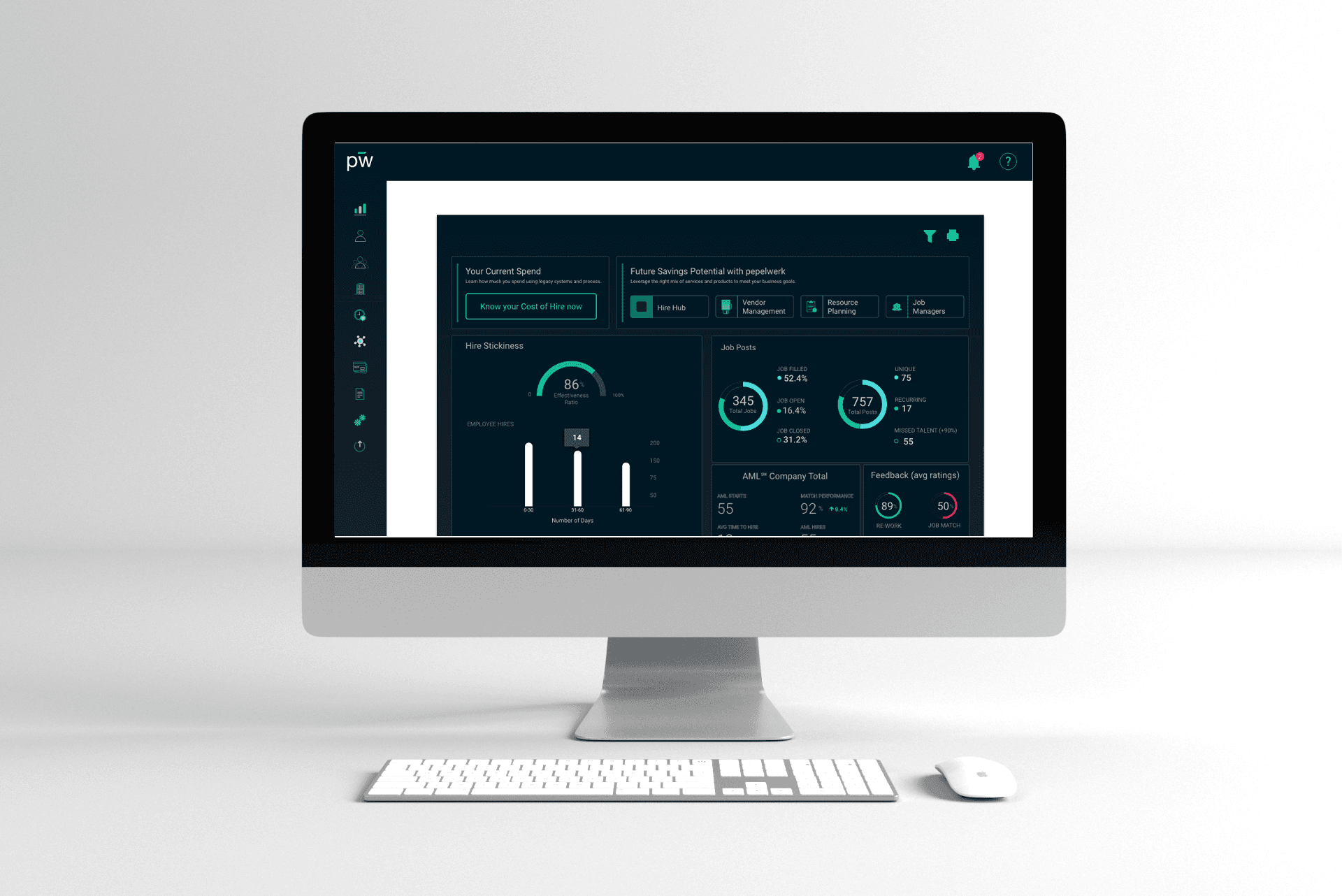
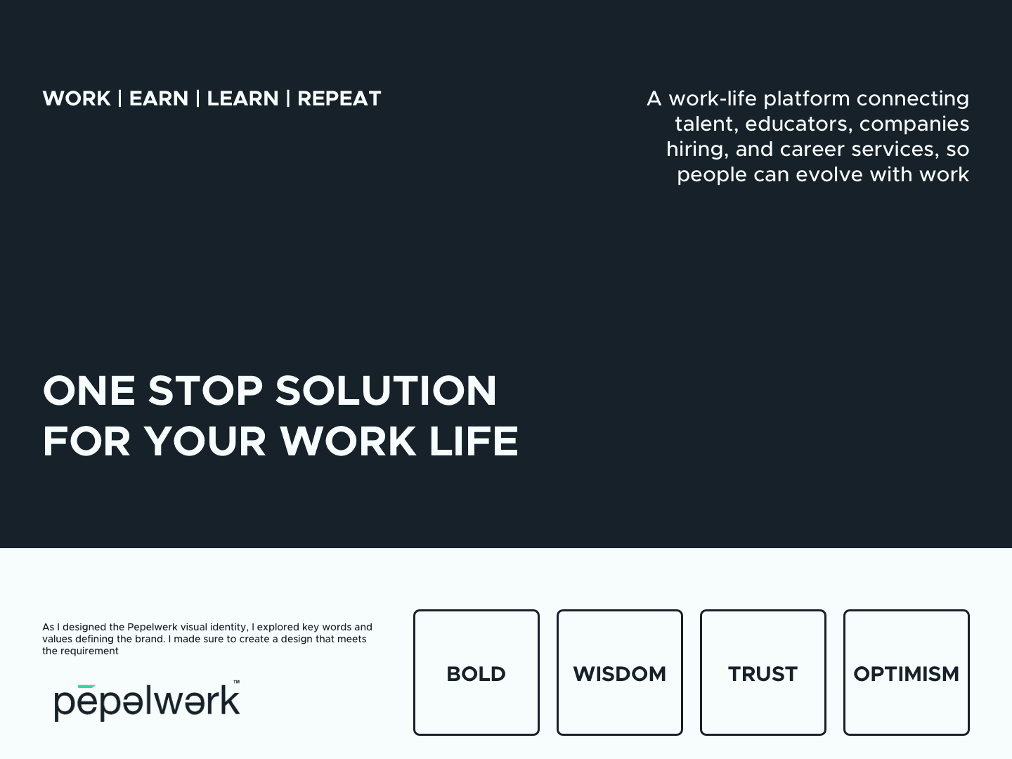
Rebranding of pepelwerk
Rebranding project for a Mobile & Web product
Problem
The requirement came as the brand needs a new lift of visual change to be attractive to the target audience
Solution
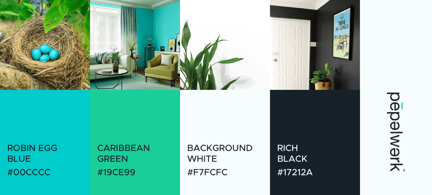
First I started with understand why there should be a change. Following some research I noticed the previous usage of colours didn't build trust with the brand. The colours usage didn't clear accessibility check and it held the target users back from interacting with it. With a quick solution of just modifying the way the existing colours were being used made it attractive for the users.
Impact
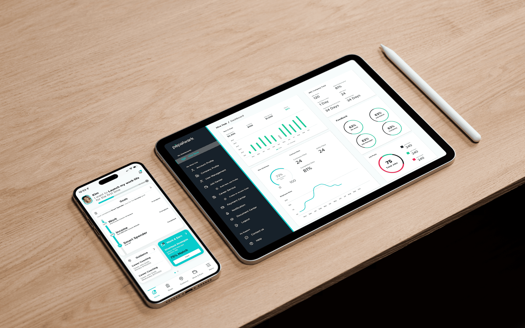
A/B Testing Result: 24/30 users found the new way of colour usage more appealing and able to trust Product Impact: After downloading the app 38% of users went through the onboarding compared to the previous result 62% rated this experience 4/5
From the team
Kim Kelley CEO/Founder “Giri is more than reliable, consistent and thoughtful about his work, he cares about the quality and impact of what he does to improve the business, create trust with his team members and deliver great customer experiences”